Journal —
A wedding invitation, from watercolor to print
I had the chance to make the wedding invitation for two friends of mine, who are marrying later this year.
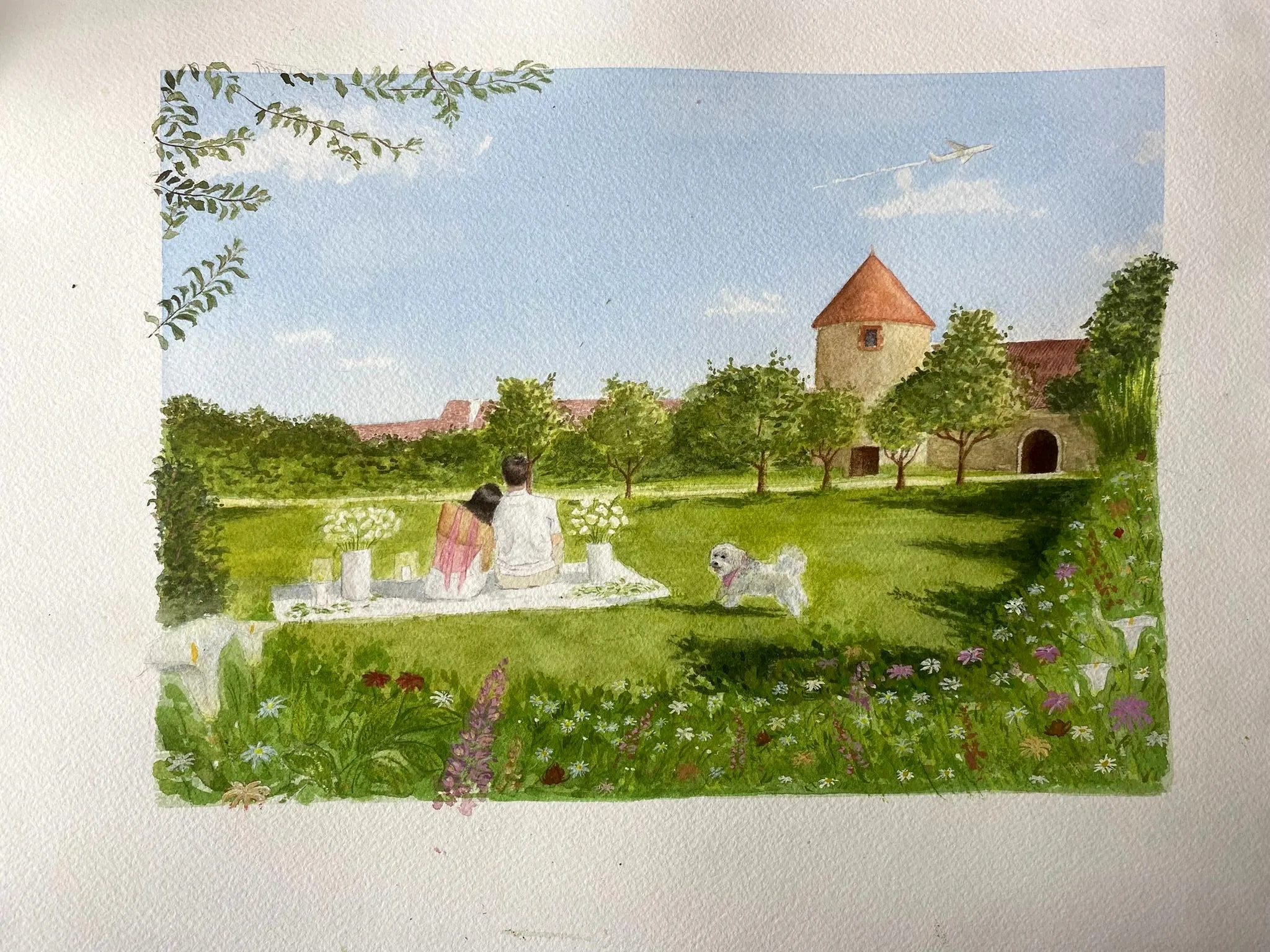
Two friends of mine are getting married this year, and it made me want to offer to do their wedding invitation in watercolor — that’s how this little project began :)
It was also a chance to level up on the “post-painting” side, with a new tool, Affinity, a free alternative to Photoshop: handling the scan, working the colours on the computer, then the printing. And to work as a team: making proposals, sharing progress, deciding together. A real little commission, and a great pleasure.
The sketch, then the design
We talked it through first, on the phone: what they liked, the little references they wanted slipped into the image. They sent me photos to work from — ones from their wedding-film shoot, which is where the château comes from, and others from the day he proposed: the clothes they were wearing, the white tablecloth, their dog, and an aeroplane.
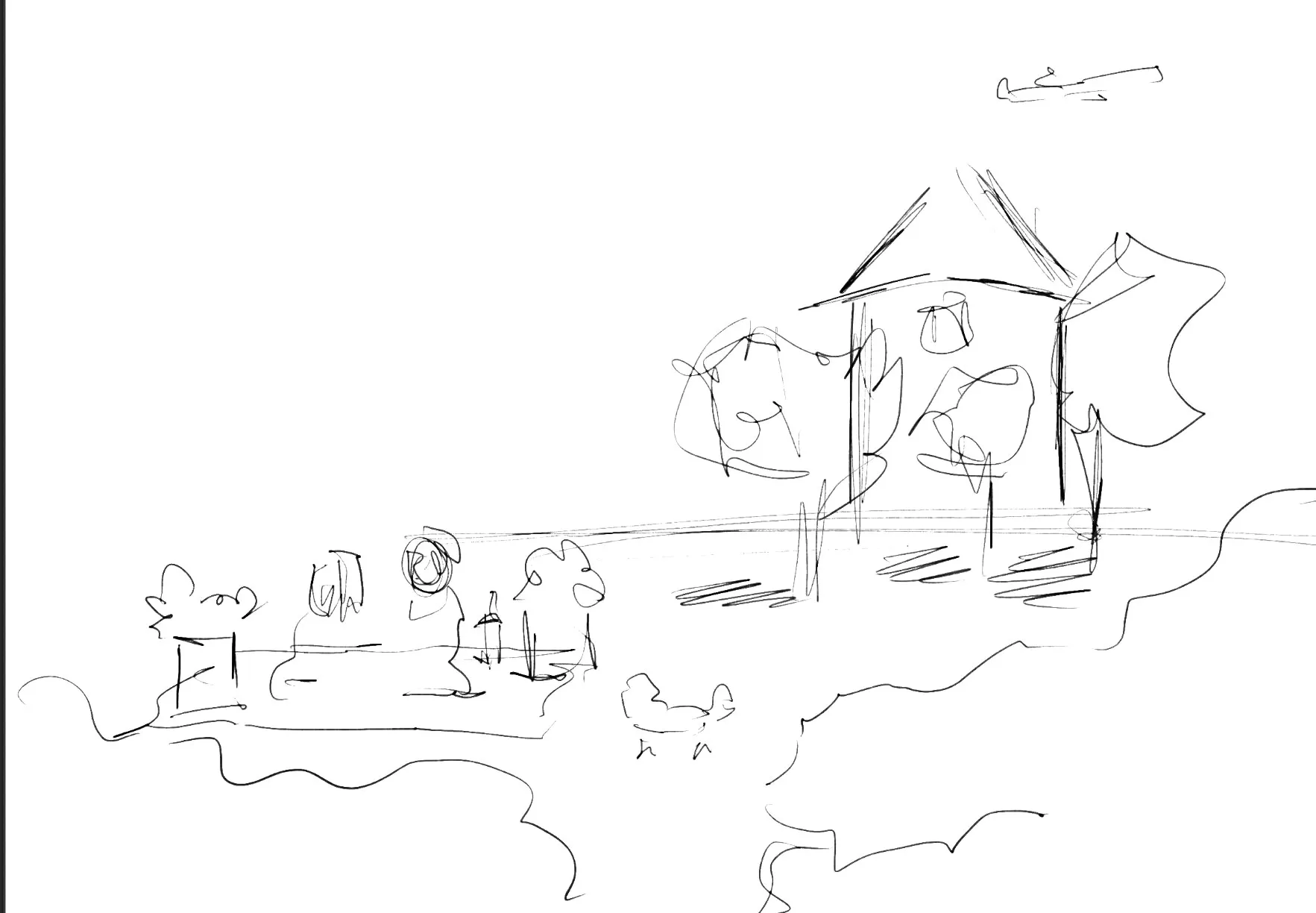
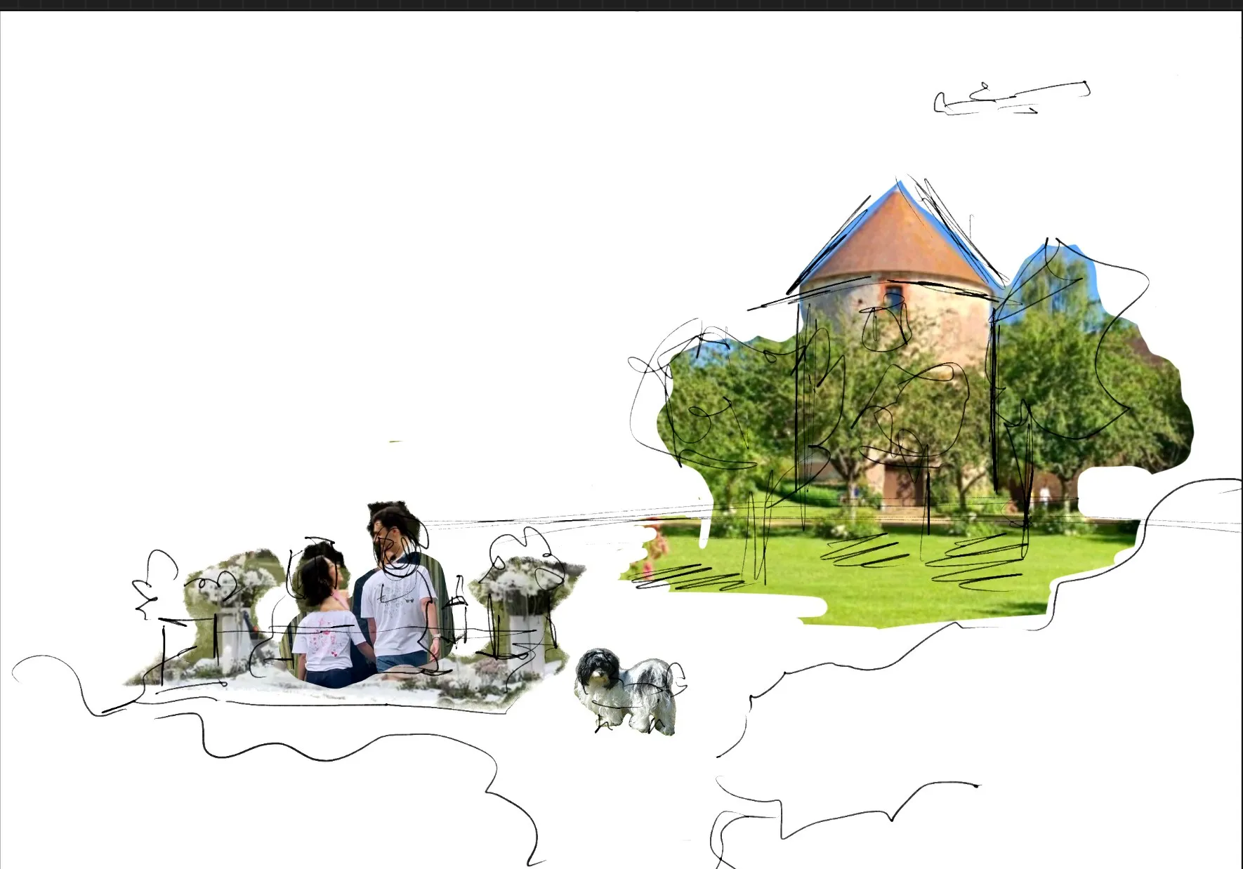
Once we were happy with the composition, I took a more detailed sketch and began the watercolor.
The watercolor, step by step
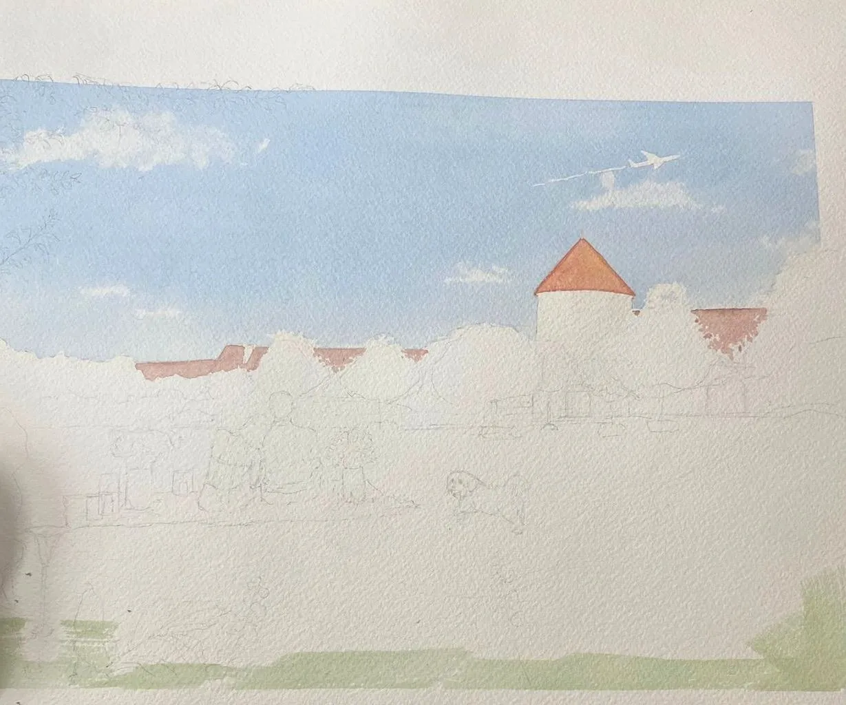
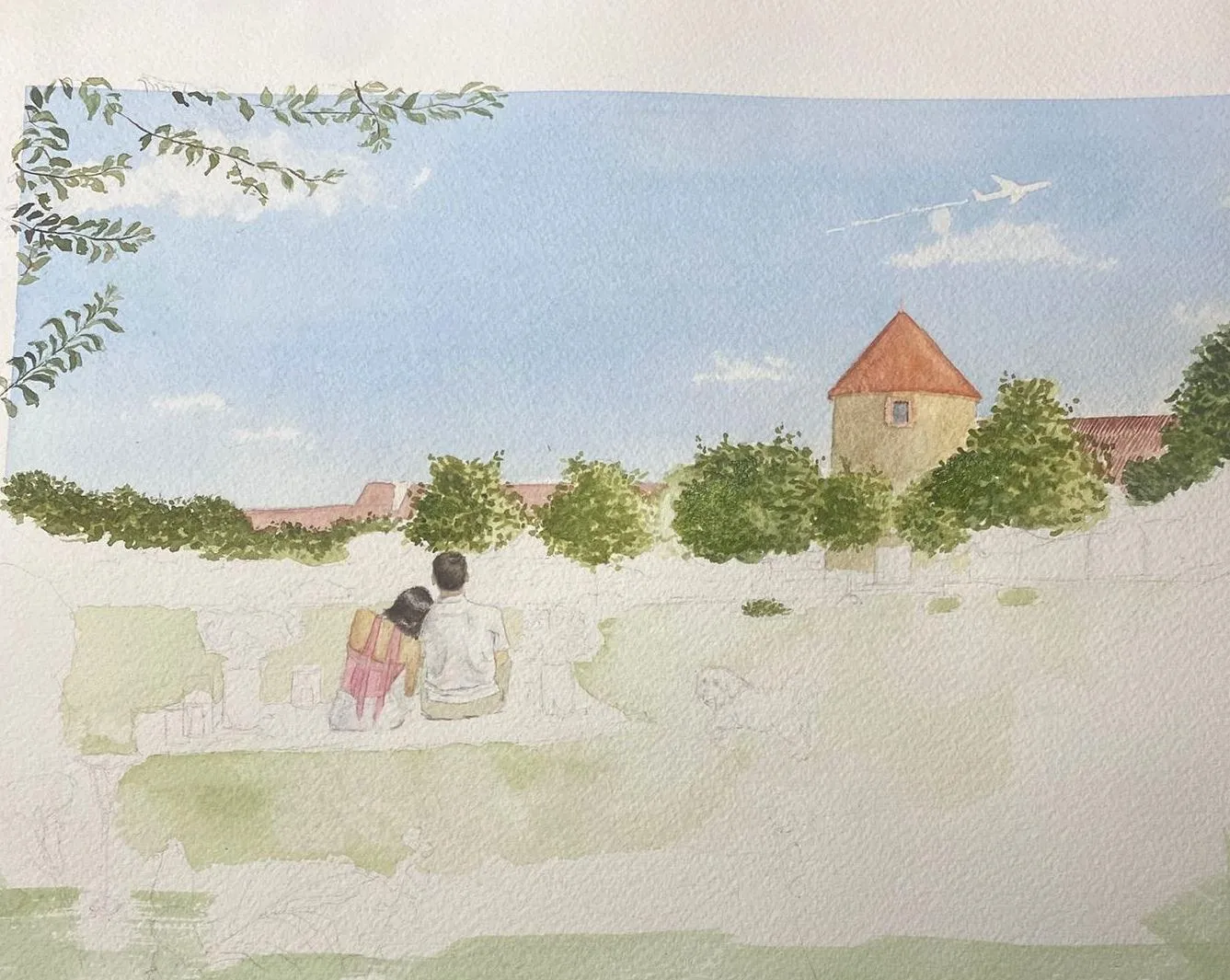
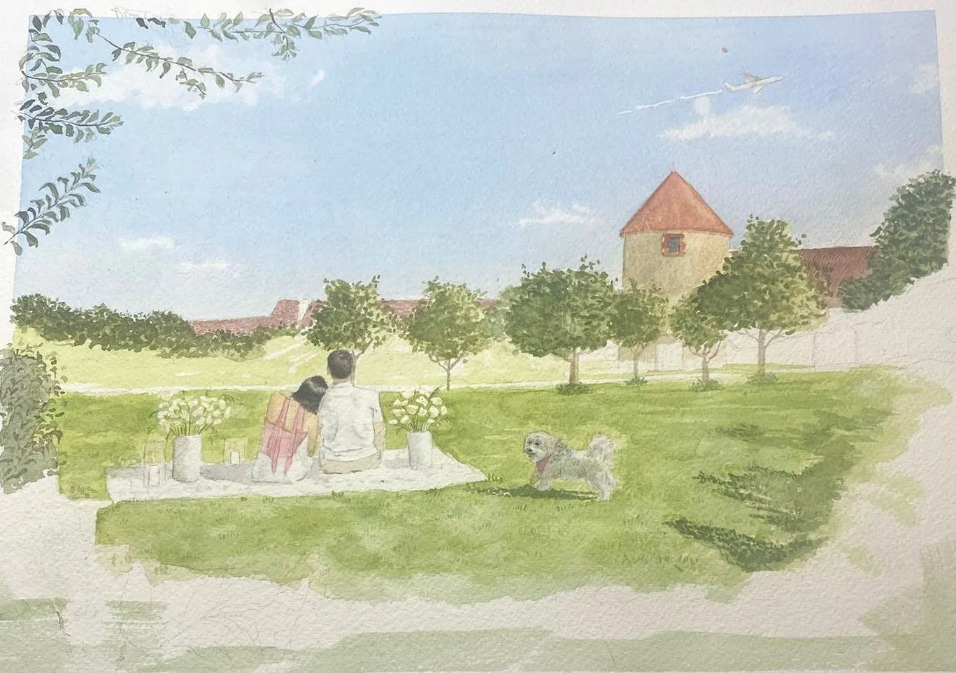
Once it was finished, I showed it to them — they loved it.
Front, back: the names and the ornaments
At first I imagined putting the two first names on the front, in calligraphy.
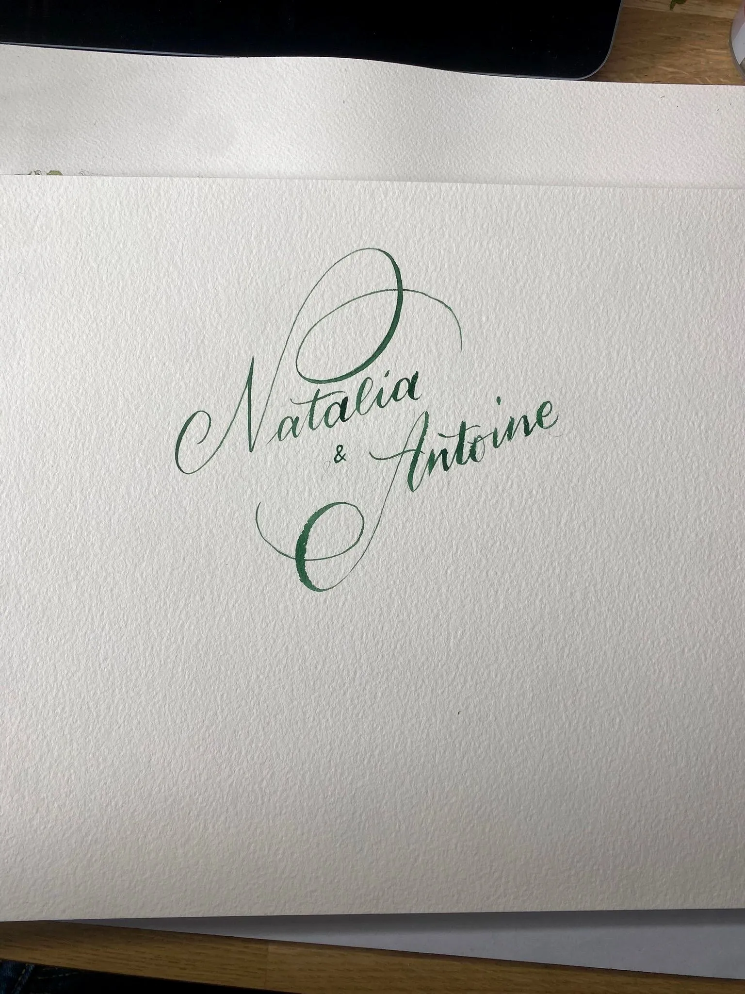
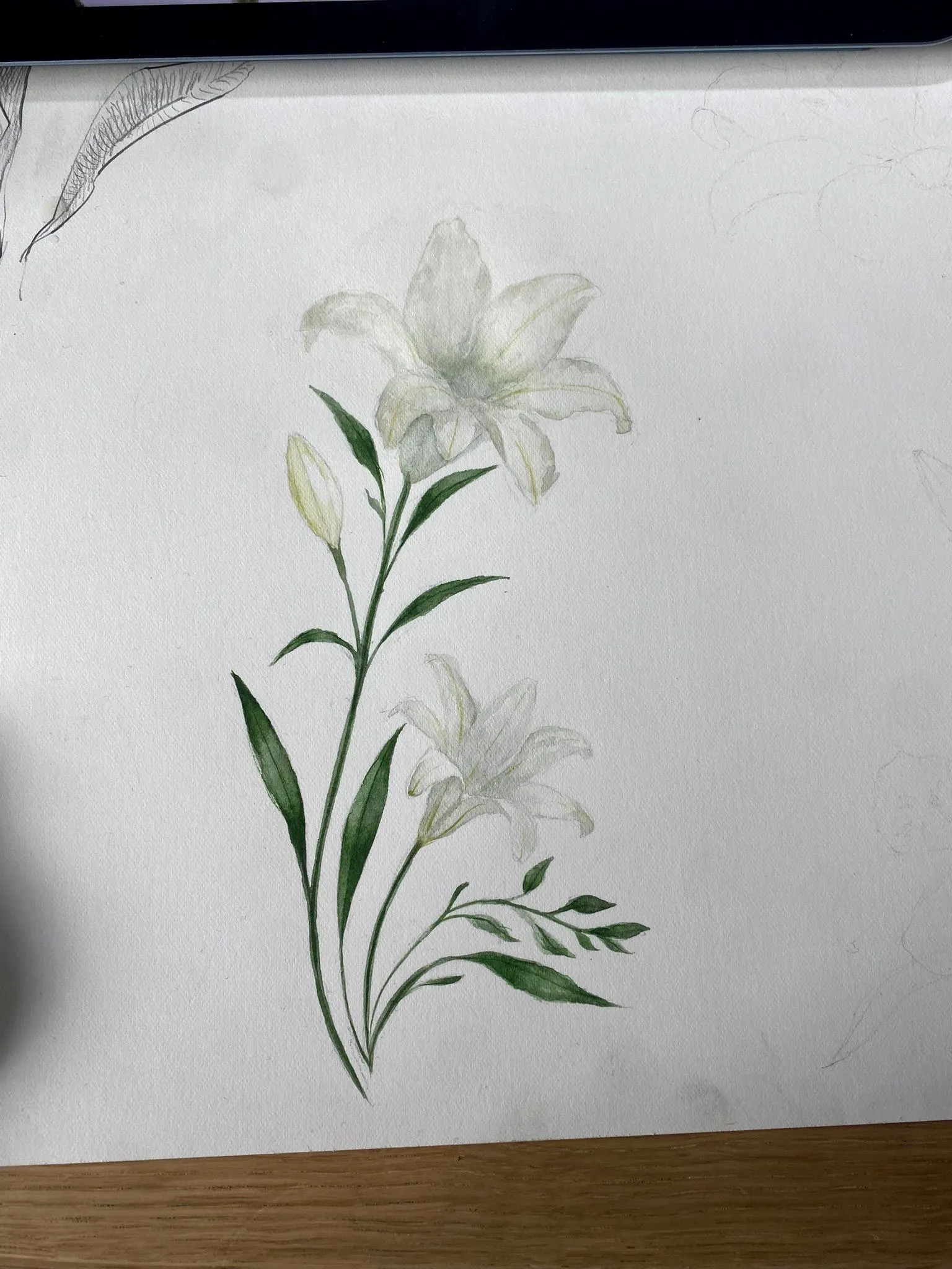
In the end, we decided to move the text to the back. For the back, Natalia wanted a few flowers: I first tried a lily, but it no longer pleased me, so I made a second version, in a smaller format.
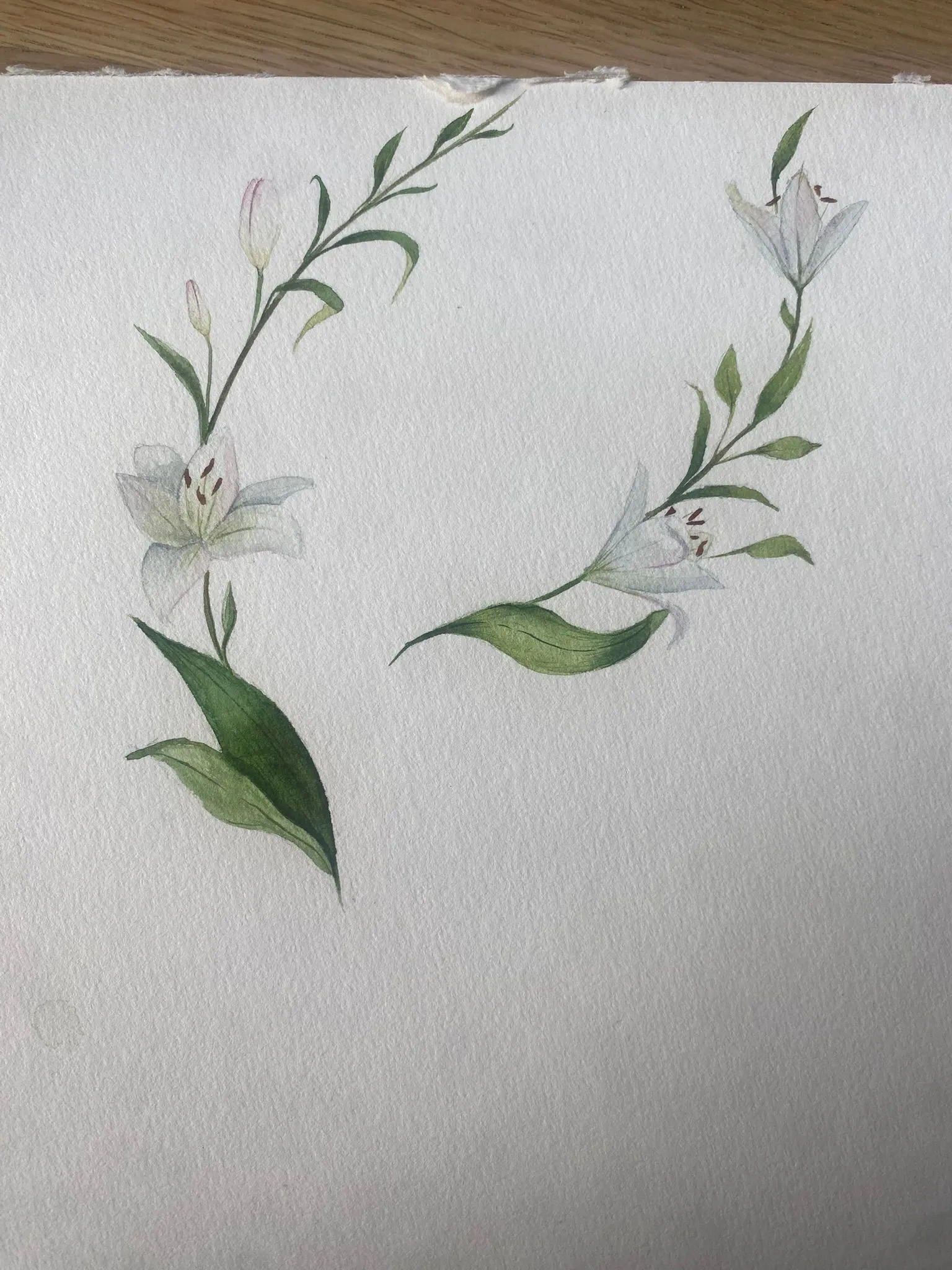
From screen to paper
As I mentioned earlier, I worked in Affinity, which I’d discovered for the sign painting, and this time tamed for colour, cropping and formatting for print.
Then came preparing a print-ready file: the bleed, the little marks so the front and back line up properly. I then had the sheets printed at a print shop, and cut them myself on a guillotine — cutting them myself was far cheaper than having the printer do it.
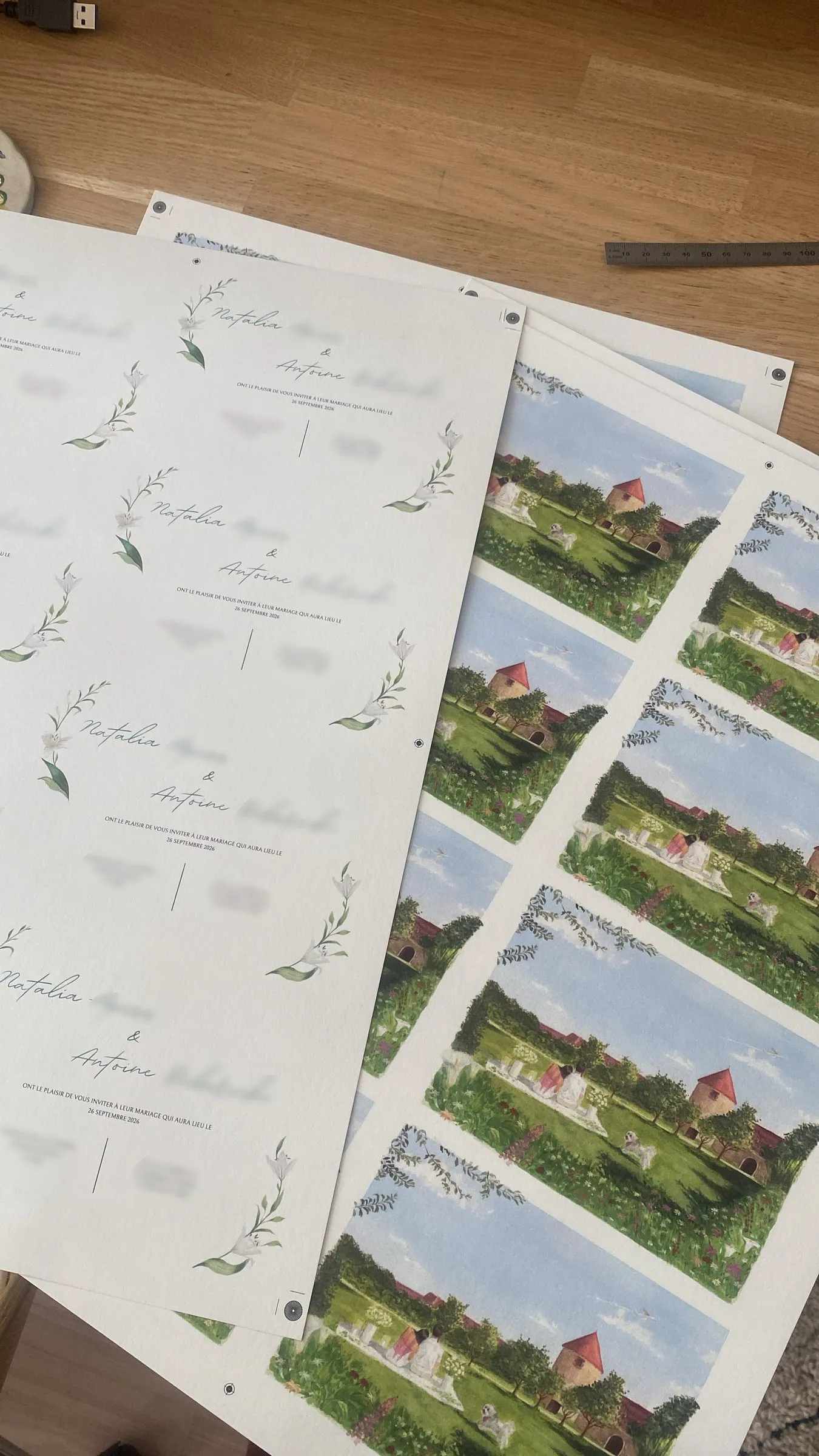
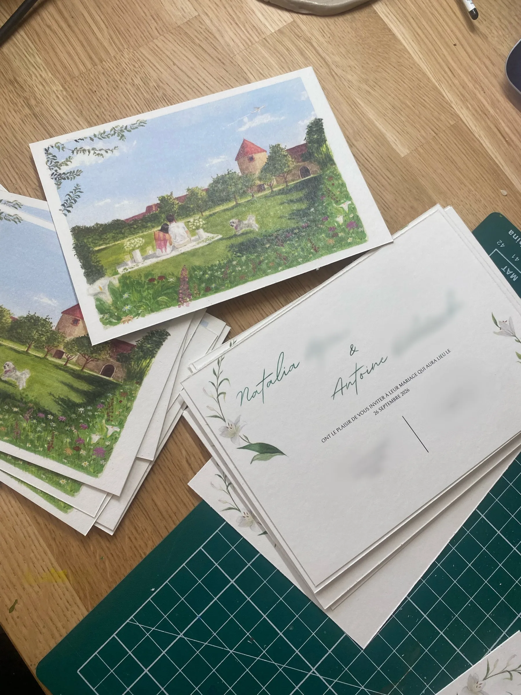
The result
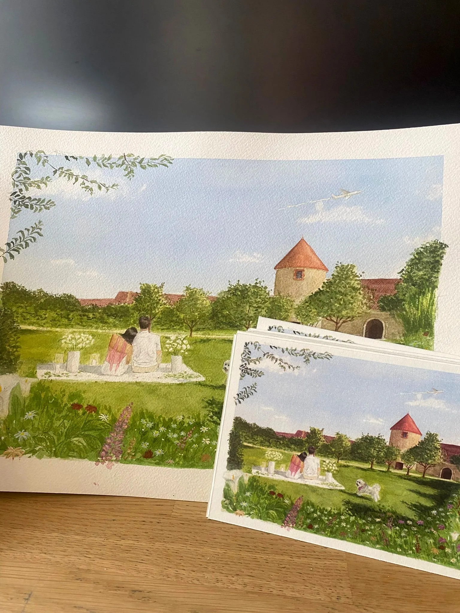
The paper was gorgeous and the result just as I’d hoped. One tiny detail, if I’m being a perfectionist: the colours aren’t exactly those of the watercolor — the little tower came out a touch redder than the original’s orange, and I could treat myself to a better guillotine… but honestly, you can hardly tell.
I’m truly delighted with the result, and I hope I’ll get the chance to do a project like this one again!!
Comments
No comments yet. Be the first!
Thank you! Your comment will appear once approved.
Oops, something went wrong. Please try again.